Design bench — Central
One place for every visual idea before it is decided. Nothing here is applied unless it says so. When an idea is taken, it moves out of this page and into the screens; when it is refused, it stays here with the reason, so it is not proposed twice.
Every small view opens its full version with one click; the source link sits beside it. The images are other people's work: internal reference material, never for a public or published page.
The candidates — how to present the app, 14-08-2026
Three references from Frank, one family: the real phone screen at the center, the capabilities arranged around it. Three different skins of the same layout, for Central's presentation pages.
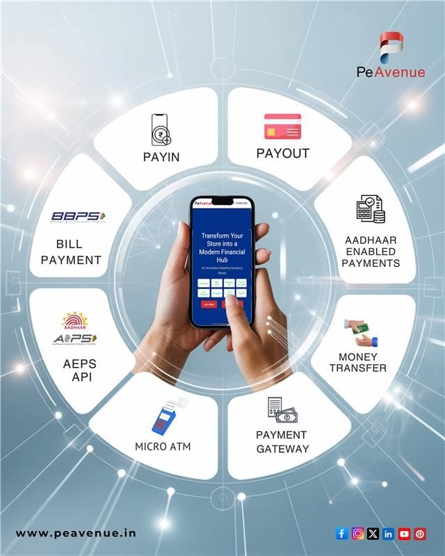
The ring of capabilities
The phone in hand at the center of a circle; each capability is a card on the ring, with a small icon.
What transfersThe geometry: Central's REAL screen in the middle, its modules on the ring. What does not: the fintech branding, the stock glow.
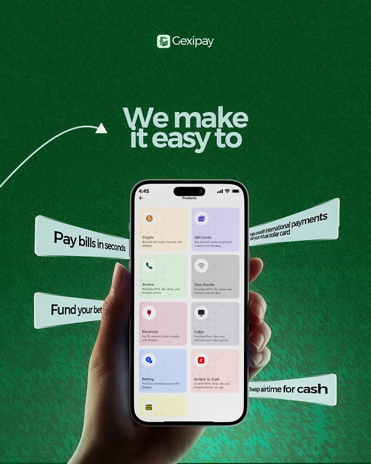
The ribbons of verbs
Deep green ground, the real product grid on the phone, angled ribbons around it — each ribbon one plain verb phrase ("Pay bills in seconds").
What transfersOne verb per ribbon, the real screen center, the confident single-color ground. What does not: the dark theme (house is light) — unless a presentation page earns it.
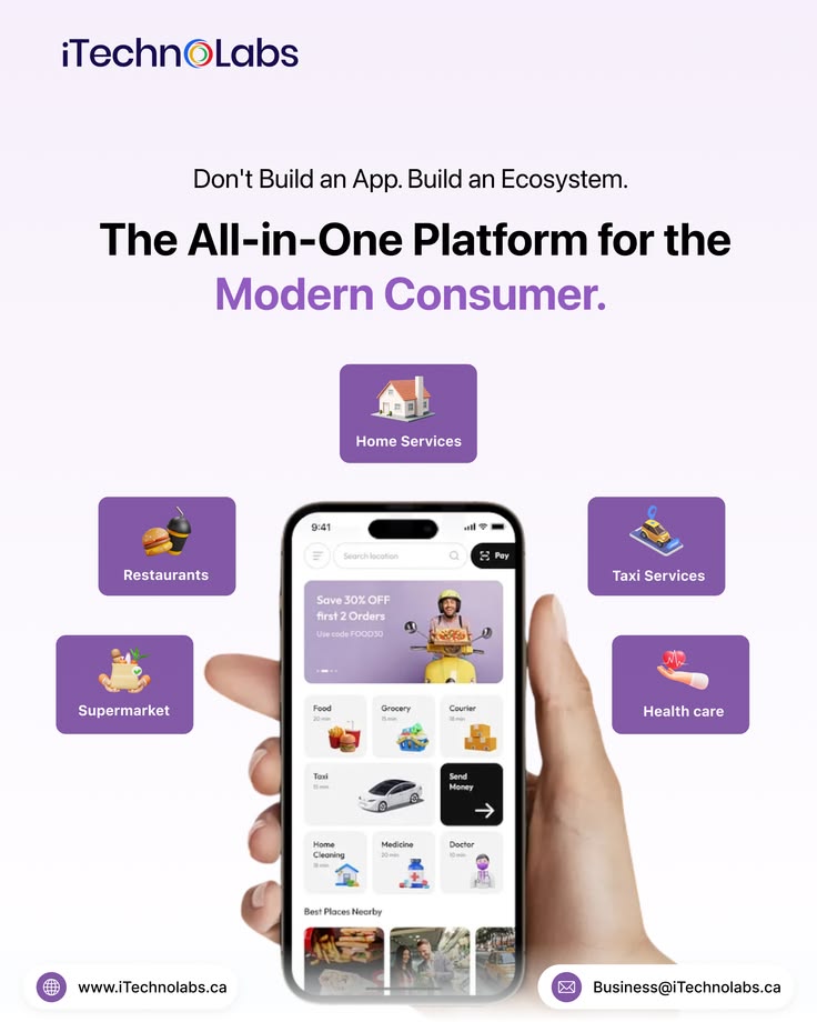
The floating chips
Light lilac ground, big two-line headline, the phone centered, rounded chips floating around it with tiny 3D objects.
What transfersThe light, calm version of the same layout; the headline doing the arguing. What does not: the 3D clipart — Central shows real artifacts, never decorative icons.
Waiting on Frank
- Which skin of the phone-center layout for Central's presentation page — recommendation: the floating chips (light), with Central's real screens; the ribbons of verbs as the wording model. Options rendered: not yet — they render in the visual session, in the real page.
Tried and refused, with the reason
Nothing yet. When something is tried and refused, it stays here with the reason, so it is not proposed twice.
Where things live
- This bench is Central's only. What serves every project moves to the studio (9 - System/ui-ux) and a line here says where it went.
- The look work (screens review, real inspiration): topic central-ui-review · the project: CENTRAL.md · presentations: presentation/