The exemplar
Read live, on the register a citizen fills: numbered sections, an asterisk after every required label, a help icon aligned on each field.
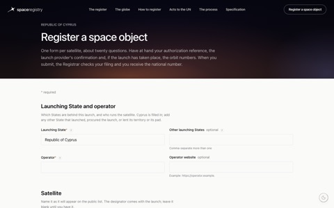
the twin's form · live: smartrules.ai/space-registry/twin/file
The rules
The opening text speaks to the person filling it
Under the title: how long it takes, what to have at hand as a short list (one item per line, a quiet bullet), what happens after submit. No mention of tiers, conventions, resolutions or design choices; that knowledge lives on the spec page.
Required fields carry an asterisk after the label
In the accent colour, and the legend « * required » is a small muted note at the right of the first section's title line, in the same colour, never a line of its own. Consistency everywhere: one meaning, one colour, one place.
Sections are numbered cards
Each section is a white card with a light shadow on the off-white page, a small accent number before its title, and one or two plain sentences under the title saying what the section asks and why. A quiet rail on the left lists the sections and ticks each one when its required fields are filled; on a phone the rail becomes a row of dots. Air above the first card equals the air between cards. Titles and labels drop « the » wherever the sentence still reads.
Help is an icon, aligned
A circled question mark next to the label, big enough to see (about 1.125rem, a 1.5px ring), centred on the label's line with a small gap, accent on hover; it opens the definition under the field. Definitions live in one file per product (the twin: twin/words.js, readable twin docs/words.md), read by the form, by the how-to page and later by the guiding agent on the screen. The word « optional » aligns the same way. Alignment is substance made visible: a misaligned icon reads as a sloppy thought.
Never make people type what a list can offer
Whenever the answer is one of a known set, a searchable list: type two letters, pick with the arrows or the mouse, several picks shown as removable tags, « not in the list: add it » at the bottom. Countries with their flags, launch sites, vehicles, kinds. Dates get a picker and read back day first. Numbers show their unit after the field and have sane bounds. Web addresses are checked as such. Codes with a shape (a designator) get a pattern, an example and the right case. What is wrong is said in plain words when the field loses focus, never as a code.
The agents that help are visible persons of the form
A helper that fills fields from the sources has a name, a panel and a button; it says where it found each value; the person accepts or corrects.
The form teaches by being good, never by commenting on itself
A model form is at once the user's form and the demonstration of what a good form is; the practices show because they are there. No presenter notes, no "show the practices" switch, no annotation of any kind. The index of sections is part of the form: it helps the person filling it and lets anyone read the form at a glance. Frank, 04-09-2026.
The evidence behind these rules
The state of the art in form design (04-09-2026): one grid of the current practices with their sources and a verdict each. Five of them are on the table to complete the rules above, at Frank's pick: a review screen before the final submit; an error summary at the top on submit, with the focus moved to it; the draft kept and resumable; values filled by a helper marked as such until the person confirms them; the browser told what each field is, so autofill works. The sectioned single page with a rail is the right shape for a professional filling a long form once or twice a year; one question per page is for the general public. The study is input; the rules on this page are ours. The private sector's practices show where it is ahead (a saved identity reused in one click, the document doing the typing, a draft that never gets lost, forms a browser agent can fill unattended, an address confirmed rather than retyped) and what a public registry must not copy (urgency, pre-checked consent, data hoarding, forced accounts, shaming on the decline path).
Before showing any form
Read it as the person filling it. Delete every sentence that serves the builder. Check:
- the bullets
- the asterisks and their legend
- the cards and the rail
- the icons' alignment
- the lists where typing was asked
- the messages in plain words
Then the house checks (tokens, slop) and a scripted walk-through in a headless browser.
Backstops: memory feedback-user-forms-speak-to-the-user.md; the registry's decisions 49 to 52; Kennedy's intuitive-ux for controls. Source: forms.md.