Nelson's analysis page: the answer in the title, the brief's order, one page
The markdown source: model.md, saved 24-09-2026. This page is its twin, regenerated from it.
Source. uganda.eregistrations.dev/analisis/plan-ea-plus/ (title "eA+ Project Plan") · written by Nelson Pérez (UNCTAD), dated 24-09-2026 · captured headless on 24-09-2026 at 1280 x 800 (desktop.png, desktop-dark.png for the dark system setting) and 390 wide (phone.png). The page's source, byte for byte as served that day, is kept with the skill: ~/.claude/skills/analysis-doc/references/model-page.html.
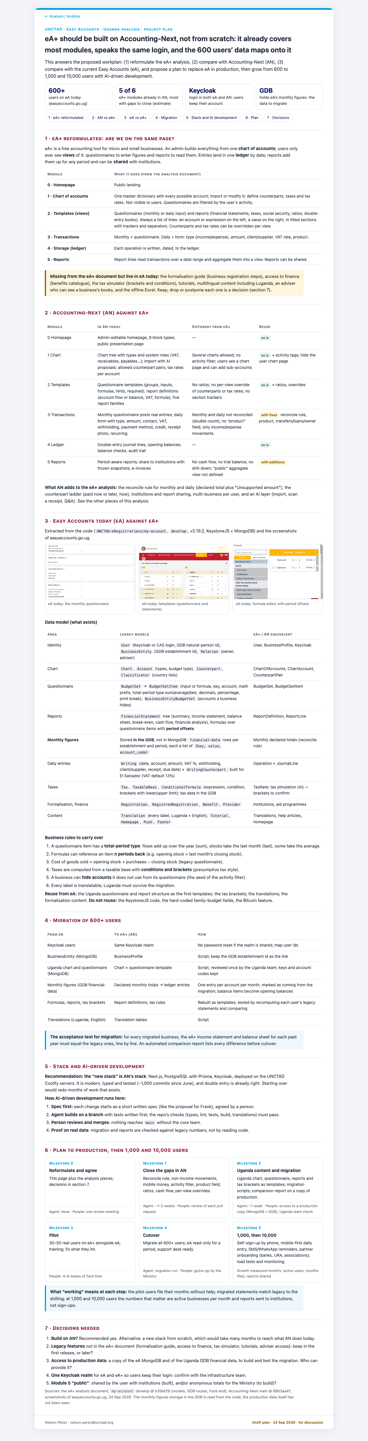
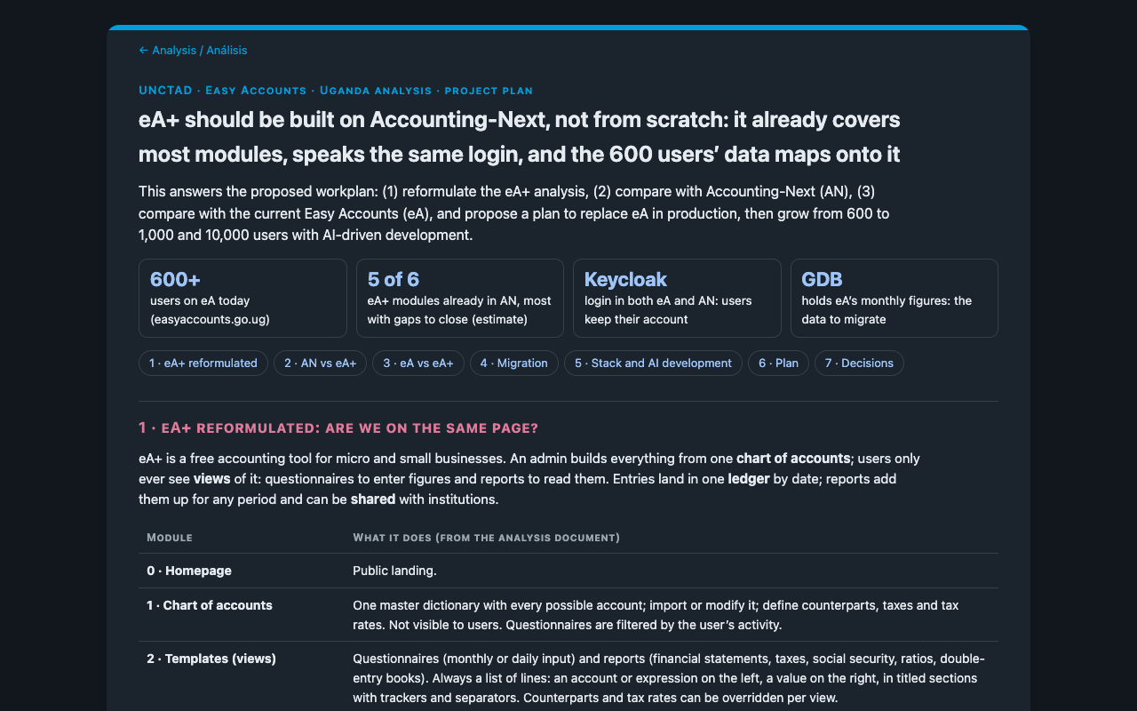

What it is. Nelson's answer to his own workplan for eA+, the next version of Easy Accounts in Uganda: the analysis restated, compared with Accounting-Next and with today's Easy Accounts, then a migration, a stack, a plan in milestones and the decisions needed.
Frank's verdict, 24-09-2026, set against his own session's answer to the same brief: better UI, and much clearer text. On his session's page: much more jargonic and difficult to understand. Later the same day: "I don't know indeed what moment 1 means, this is session jargon."
Picked for: every analysis document a session writes for a colleague, a partner or a team. Skill analysis-doc (~/.claude/skills/analysis-doc/), with the template, the check script and the measured style study.
What the eye meets
The answer first. The title is the recommendation with its three reasons: "eA+ should be built on Accounting-Next, not from scratch: it already covers most modules, speaks the same login, and the 600 users' data maps onto it". Under it, one sentence names the three workplan items the page answers, then four tiles, each led by a large navy figure or name (600+, 5 of 6, Keycloak, GDB), then seven chips to the sections.
A white sheet on a grey page. One card at most 1040px wide, radius 14px, one soft shadow, a 6px blue band across the top. Inside, one system sans at eleven sizes from 11.5 to 25px; hierarchy by weight, colour and small caps: maroon small-caps section titles at 17px, grey small-caps table headers at 12px, a blue small-caps kicker at 13px.
Colour that means something. Blue for the frame and navigation, maroon for section titles, navy for figures, and three verdict pills in plain words: green "as is", amber "with fixes" or "with additions". An amber box marks a gap, a blue box an acceptance test. Every colour is a token with a dark value.
The reader's structure. Sections numbered 1 to 7 in the order of the requester's workplan, each closing on a bold line ("Reuse from eA: … Do not reuse: …"). Code names sit in one data-model table and in the sources line; the sources line says what was not seen.
What we copy
- The anatomy, in order: kicker, finding as title, lead, a row of tiles, contents chips, numbered sections, tables of at most four columns with verdict pills, boxes, real screenshots, business rules with examples, milestone cards with the effort split, decisions, sources line, footer with author and status.
- The tokens and the type scale, unchanged, in the skill's
template.html. - The writing: the brief's words and order, one page, uncertainty marked where the number is.
What we refuse or repair
Frank reviewed the page on 24-09-2026 and three of his rules replace the model's choices:
- The tiles answer the brief's questions. "These indicators are not really relevant ... they should be related to the questions in the prompt." One tile per question, in the brief's order: the question as the small label, the short answer in bold ("Mostly yes"), one line of reason; no number for its own sake.
- Every section and subsection folds, open by default, with only the title and a quiet chevron in the summary: the hairline above each section title goes.
- Decisions in his question format: a red numbered question mark, the question, then "(Pick one: option, recommended · …)" or "(Yes/no. I would say yes, because …)", reasoning on a line below. "Recommended yes. Alternative: …" is replaced.
The other repairs:
- Colours written outside the tokens (screenshot cards stay white in dark mode; the draft status falls to 2.7:1 on the dark sheet): moved to tokens.
- Small blue text at 3.0:1 on white (kicker, back link, milestone labels): one step darker, 4.9:1.
- Agent effort in weeks, dates as "24 Sep 2026", em dashes in empty cells, links in the same tab: Frank's house rules replace them.
- A headline figure the page does not support ("5 of 6", where the page's own table shows six of six present): the skill asks for every figure to trace to the page.
Measured tokens
| Slot | Light | Dark |
|---|---|---|
page --bg |
#f2f4f7 | #11171d |
sheet --paper |
#fff | #1b232c |
text --ink |
#1d2733 | #e6ebf0 |
muted --muted |
#5b6673 | #9aa6b2 |
hairline --line |
#dde3ea | #34404c |
band and edges --blue |
#009edb | #009edb |
section titles --maroon |
#8a1538 | #e07a9a |
figures and chips --navy |
#0b1560 | #9fc5f8 |
tint --soft |
#eef7fc | #15303f |
verdict green --ok / --okbg |
#1f6b45 / #e8f5ee | #6fd19c / #12301f |
verdict amber --warn / --warnbg |
#8a5a00 / #fff4dc | #f2c46b / #3a2c0d |
| type | body 15px/1.55, h1 25px weight 650, h2 17px small caps, system sans | same |
| geometry | sheet 1040px, radius 14px, tiles 10px, cards 12px, band 6px | same |
Full measurements, and the comparison with the page Frank found hard to read: ~/.claude/skills/analysis-doc/references/style-study.md.