Inspiration · studied reference · 08-08-2026
ScreensDesign
A paid library of 2,622 top-grossing iOS apps, each cut into its onboarding and paywall screens with revenue attached. Studied live on 08-08-2026 — what it actually offers, what is free, what an earlier check got half-right about an installable MCP, and what a public-service consultation tool should copy, adapt, or refuse from it. Full plain-word version: screensdesign.md.
A teardown library, not a mood board. Every app gets one page: a single scrubbable video of its real onboarding-to-paywall flow, cut into named, timestamped chapters — one app studied had "Onboarding and Subscribing 00:02–00:58", "Generating and Managing Avatars 00:46–01:59", "Exploring and Creating New Packs 02:00–03:04" — a strip of timestamped screen thumbnails under the video, the app's revenue, installs, release date and developer, and a grid of similar apps sorted the same way.
Ask, don't filter. A natural-language search bar sits where a search box usually goes — the homepage's own example: "Show me meditation paywalls with a free trial, sorted by revenue…" — next to a four-group filter panel: App basics (category, release/updates), Business (installs, revenue), Onboarding (steps, features, permission screens, social proof), Paywall (type, features).
A second product now. Since a "V2" launch, a tool called Create sits beside the library: type one sentence describing an app and it generates an onboarding flow, paywall and screen set from the same 2,600-app corpus, meant to be handed to an AI coding agent. The one-line entry already in  references.md predates this — the site is no longer only a gallery.
Who it is for. The homepage is a wall of growth-marketer testimonials and a customer logo row (RevenueCat, Superwall, Noom, Headway, Suno, Polymarket among them), built around one question: how to turn a stranger into a paying subscriber, fast.
Free, no account
- Every app card: name, developer, revenue, installs, release date, category
- The filter panel — browsable and usable
- The first few seconds of each teardown video, and the first few screen thumbnails
Paid — "Full Pro," $24.92/mo billed annually ($299/yr)
- Every thumbnail past the free first few (each shows "Unlock Pro" over its timestamp)
- The full similar-apps grid
- "Ask the library" — the natural-language search
- 2,400 Create credits a year, and MCP access
The page's own pricing copy reads "EVERYTHING IN PRO, PLUS" above that feature list — suggesting a lower "Pro" tier exists or once existed. Only the one "Full Pro" card rendered when checked, so that is what this note can confirm. Read plainly: a freemium teardown library priced like a professional tool. Nothing is free to export; everything free is free to look at only.
Recorded 08-08-2026 so it need not be re-checked in three months. The earlier check — /mcp, /api and a nonsense path all return the identical page, byte for byte — is correct for a plain fetch, and it is the wrong way to answer "is anything installable" on a site built this way.
ScreensDesign is a Next.js app whose real routing happens inside the browser, after its own JavaScript runs. A bare curl only ever sees the page the server hands back before that JavaScript decides anything — so every route the server does not resolve looks the same:
| Route | Plain fetch (no JavaScript) | Once JavaScript runs |
|---|---|---|
/ | 9,089 bytes — the real homepage | the real homepage |
/mcp | 8,502 bytes — generic shell, identical hash to the two rows below | real, distinct page — MCP setup instructions |
/api | 8,502 bytes — same generic shell | falls through to the homepage — not a real page |
| a made-up path | 8,502 bytes — same generic shell | falls through to the homepage — not a real page |
Once a JavaScript-executing browser lets the client-side router decide, /api still renders nothing but the homepage — it really is a dead end. /mcp is not. It renders a page titled "ScreensDesign MCP for any AI," with setup steps for Claude Code, Claude Web, ChatGPT, Codex, Cursor, OpenClaw and others, naming a real hosted server — https://api.screensdesign.com/v1/mcp (Streamable HTTP) — behind OAuth sign-in, plus a public companion skill: npx -y skills add https://github.com/screensdesign-com/screensdesign-agent-skill.
Both pieces check out on their own. A direct request to api.screensdesign.com/v1/mcp answers 401 with WWW-Authenticate: Bearer realm="ScreensDesign MCP" — the reply of a real, running, spec-correct MCP server asking to be authenticated, not a placeholder. The GitHub repo 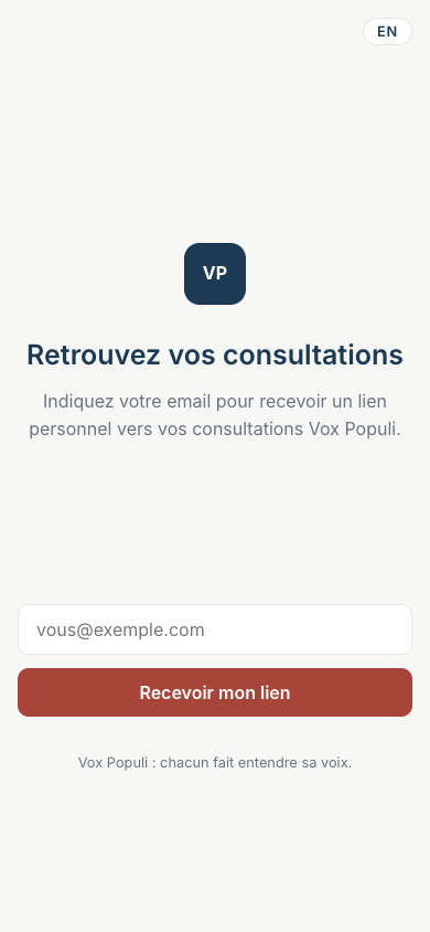 screensdesign-com/screensdesign-agent-skill is public and real.
Verdict, in full. No public REST API, no Figma plugin, no export format — /api is genuinely nothing. But there IS a real, installable capability: a hosted MCP server, gated behind a paid ScreensDesign login and OAuth, reachable only once a client actually runs the page's JavaScript. Next time an ambiguous route needs checking on a site built this way, check it with a JavaScript-executing fetch before calling it a dead end — a bare curl cannot tell "no route here" apart from "a route that needs the browser to decide."
Five moves, in plain words
- The story cut, not the slideshow
- One continuous scrubbable video with named, timestamped chapters reads as a flow someone actually lived through, not a folder of stills. Worth borrowing even without the tool: when documenting any flow, name its phases and give each a time or a step count.
- Proof travels with the object
- A revenue figure sits beside every app card and on every detail page — the claim and its evidence are never more than one glance apart.
- A four-group checklist for a subscription app's first minutes
- App basics, business, onboarding, paywall — usable on its own, independent of the tool, as a way to think about what matters early in a flow.
- Ask, don't filter
- The search bar is phrased as a question, not a set of dropdowns. It treats browsing as something you ask for.
- The gate shows its own size first
- A locked thumbnail still shows its timestamp under "Unlock Pro" — you see exactly how much more exists before being asked to pay for it.
A different bet. ScreensDesign's 2,600 apps are almost all optimising for one thing: turn a stranger into a paying subscriber inside one sitting. Vox Populi asks a mayor's staff, in front of their own citizens, to trust a process with public opinion. Conversion pressure and civic trust are not the same currency — some patterns transfer straight, some need real adapting, one whole category stays refused.
Two open problems, not redesigned here, only pointed at — both are exactly the kind of screen ScreensDesign is strongest on.
voxpopuli.one/app/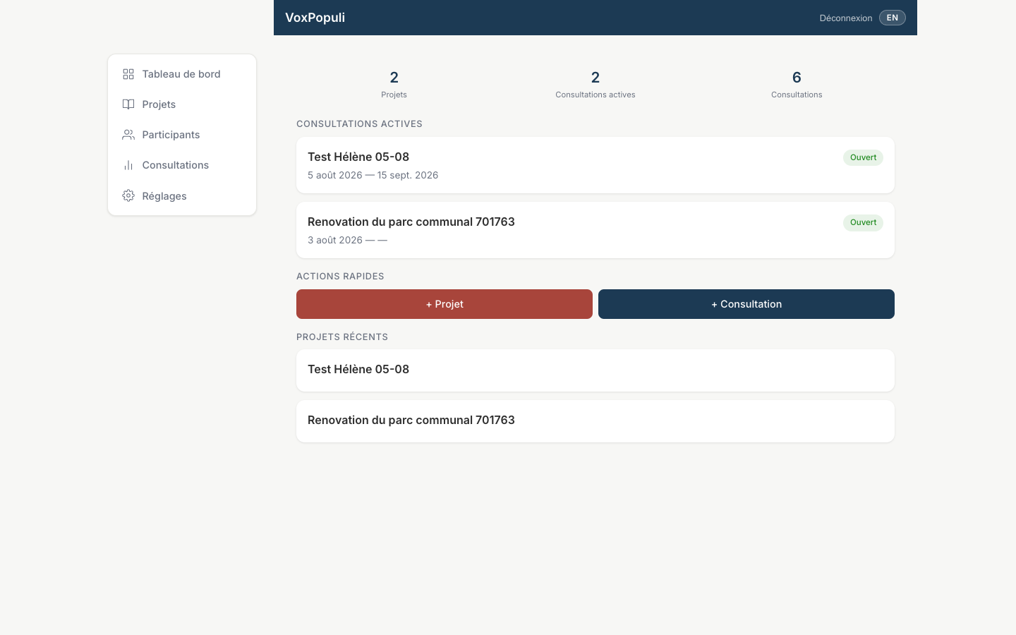 voxpopuli.one/admin/
Proof, right where the doubt is
Every ScreensDesign screen puts a real number beside the claim it makes — "$59M/mo" next to "Claude by Anthropic," a revenue figure on every app card. The member app's first screen has no such thing: a logo square, a title, a paragraph, a large empty gap, then an email field. Nothing tells a citizen this is a real tool their own town already uses, before it asks for an email. The move is not "add a number" for its own sake — it is putting proof of the thing exactly where trust is being asked for. A named, real example (an actual commune, an actual open question) in that gap does for a citizen what the revenue figure does for an app buyer.
Give the empty gap a job
ScreensDesign never leaves a space doing nothing — it always shows a number, a name, a chapter or a next step. The console's dashboard is not broken, it is correct: two projects, two active consultations, six consultations, two short lists, two buttons. On a big screen it still reads as unfinished, because the space below that real content says nothing. On a low-count dashboard, empty space below real content needs a next-step line or a plain state message — "nothing else yet, here is what to add next" — the same way a ScreensDesign screen never just goes quiet.
Sort by a trust number, not a money number
ScreensDesign's whole order is "top-grossing" — money first. A civic tool has its own honest numbers instead: citizens reached, citizens who actually answered, communes already running it. Using those numbers the way ScreensDesign uses revenue is the adapted version of the pattern. Money itself, as a headline figure on a citizen-facing screen, would read as exactly the wrong kind of proof for this product.
The conversion playbook itself
Pre-permission explainers written to soften an ask, single-select persona pickers before any value is shown, paywalls dressed as feature lists, urgency countdowns, "join 1M users" testimonial walls — these exist on ScreensDesign because they measurably raise subscription rates. On a tool a citizen is asked to trust with a civic opinion, that same pressure reads as manipulation, not welcome. Refused outright, not softened.
Consumer-app density as a bar to clear
Seeing 2,600 tightly packed onboarding flows makes "fill more of the screen" feel like the obvious fix for anything that looks sparse. Resist it for the console: three honest numbers and two short lists are not thin, they are legible. The real fix for the empty gap above is one next-step line, not a wall of stat tiles borrowed from a fitness app.
No screenshots of ScreensDesign's app grids, teardown videos, or screen-thumbnail strips appear on this page. That curation — which apps, which screens, which order — is ScreensDesign's paid product, not the underlying apps' public screens (the standing rule at the top of references.md). Everything above is a plain-word note on a pattern seen live, cited by URL, dated 08-08-2026. The two images on this page ARE ours: live screenshots of Vox Populi's own pages, taken the same day — evidence for the lessons, not decoration. Fewer pictures, on purpose.