Liked models
The models Frank picked
The bank the modern-ui skill fills: every model Frank chose from a 10-thumbnail round is stored here: its capture, its source, and how the effect is made. At the next gate question, these are offered first, by thumbnail. One folder per model: <slug>/thumb.png + <slug>/model.md.
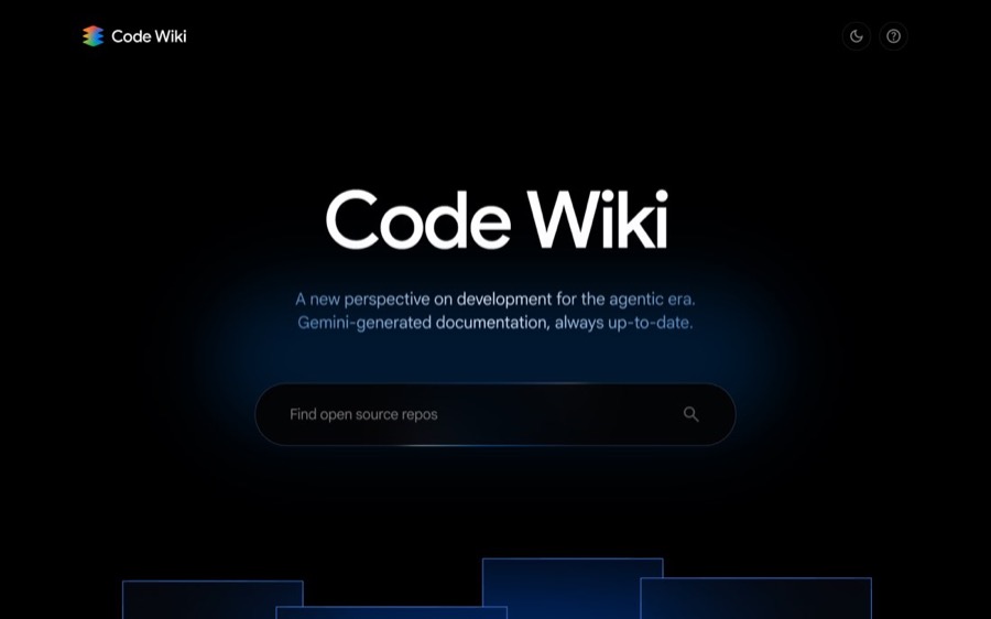
Code Wiki (Google)
Light without a single light, and 3D with no 3D model: a Fresnel rim on flat planes, a back-face pass for thickness, hairline outlines, a 30° lens. source · 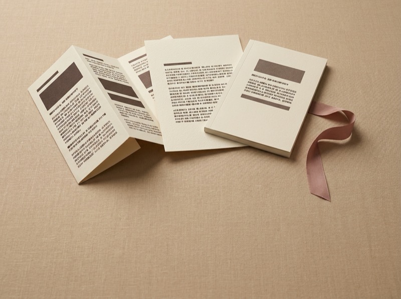 notes ·
 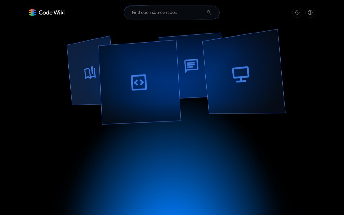 the panels ·
 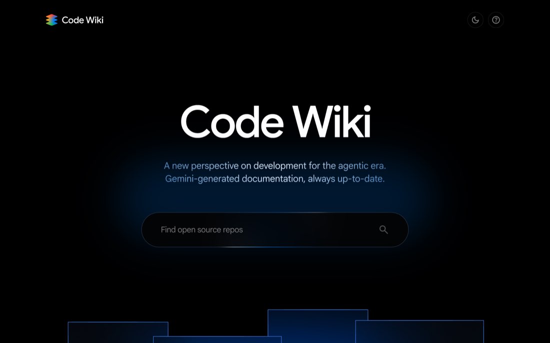 the glow
Banked 15-08-2026, as the example to study for the use of light and the management of 3D.
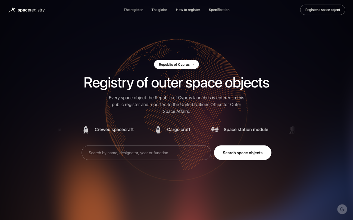
Celia's space registry
A dot-matrix world map as the whole signature, always in the page's own accent, two accent variants (orange/violet) on one shared paper. source · notes · skill: space-registry-ui
Picked 02-09-2026. His words: «this is Celia's proposed UI, much better than my version; make a template/skill out of it.»
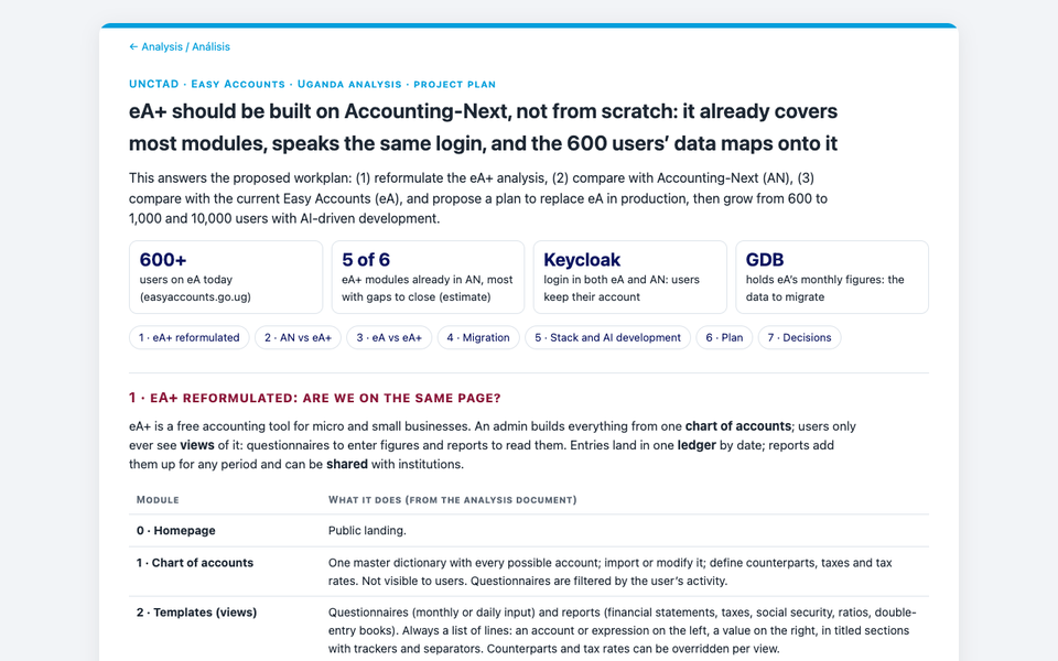
Nelson's analysis page
The recommendation as the title, sections numbered in the order of the requester's workplan, verdicts as plain-word pills, the whole answer on one page. Its tiles are redone to answer the brief's questions. source · notes · skill: analysis-doc
Picked 24-09-2026 for analysis documents. His words: «better UI, and much clearer text.»
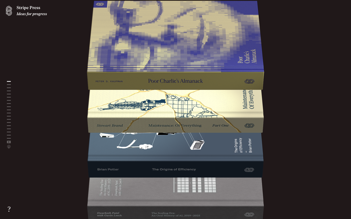
Stripe Press
Items presented as physical objects on an almost empty ground, one two-colour pair per item, one paragraph each. source · notes · 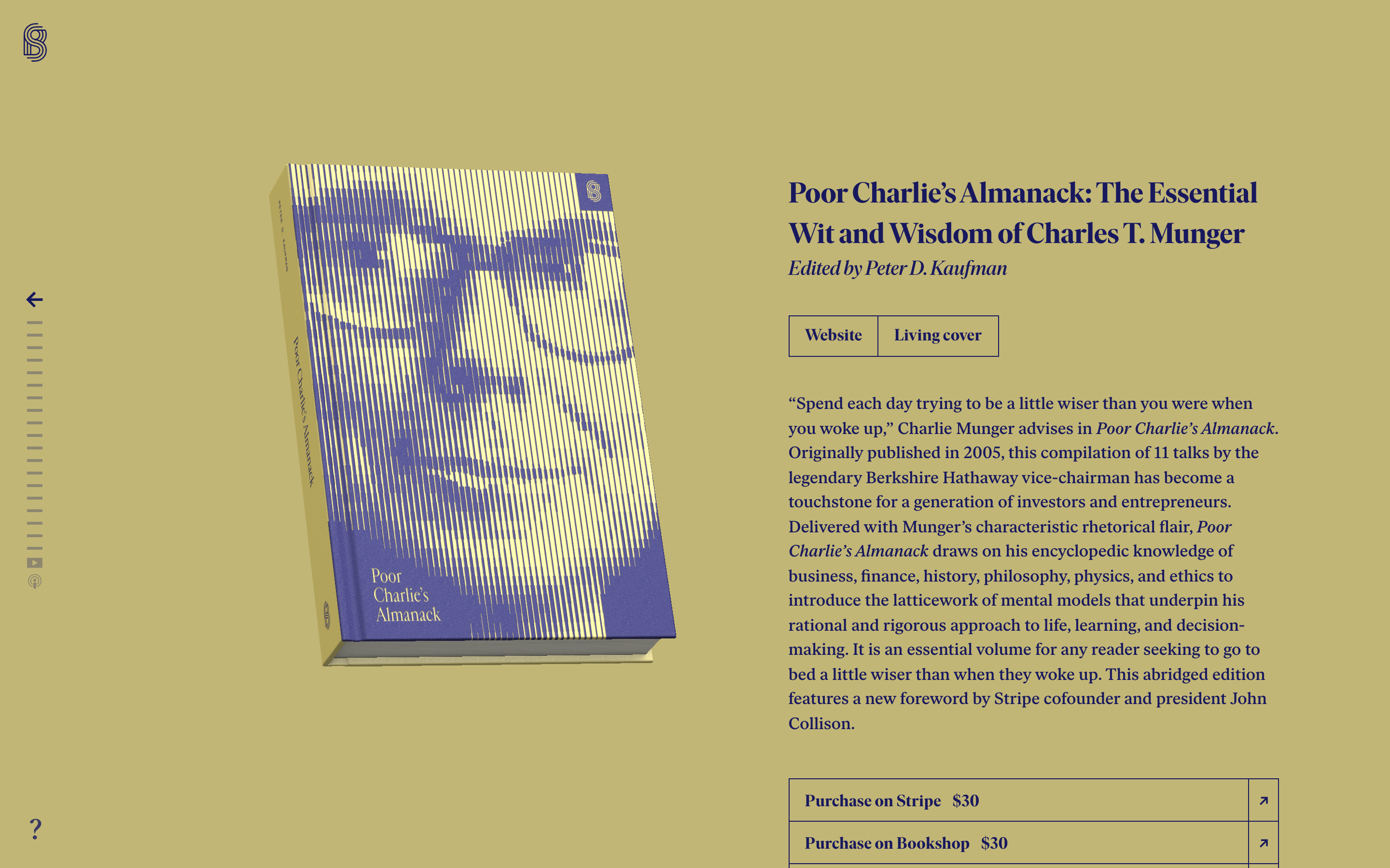 one item ·
 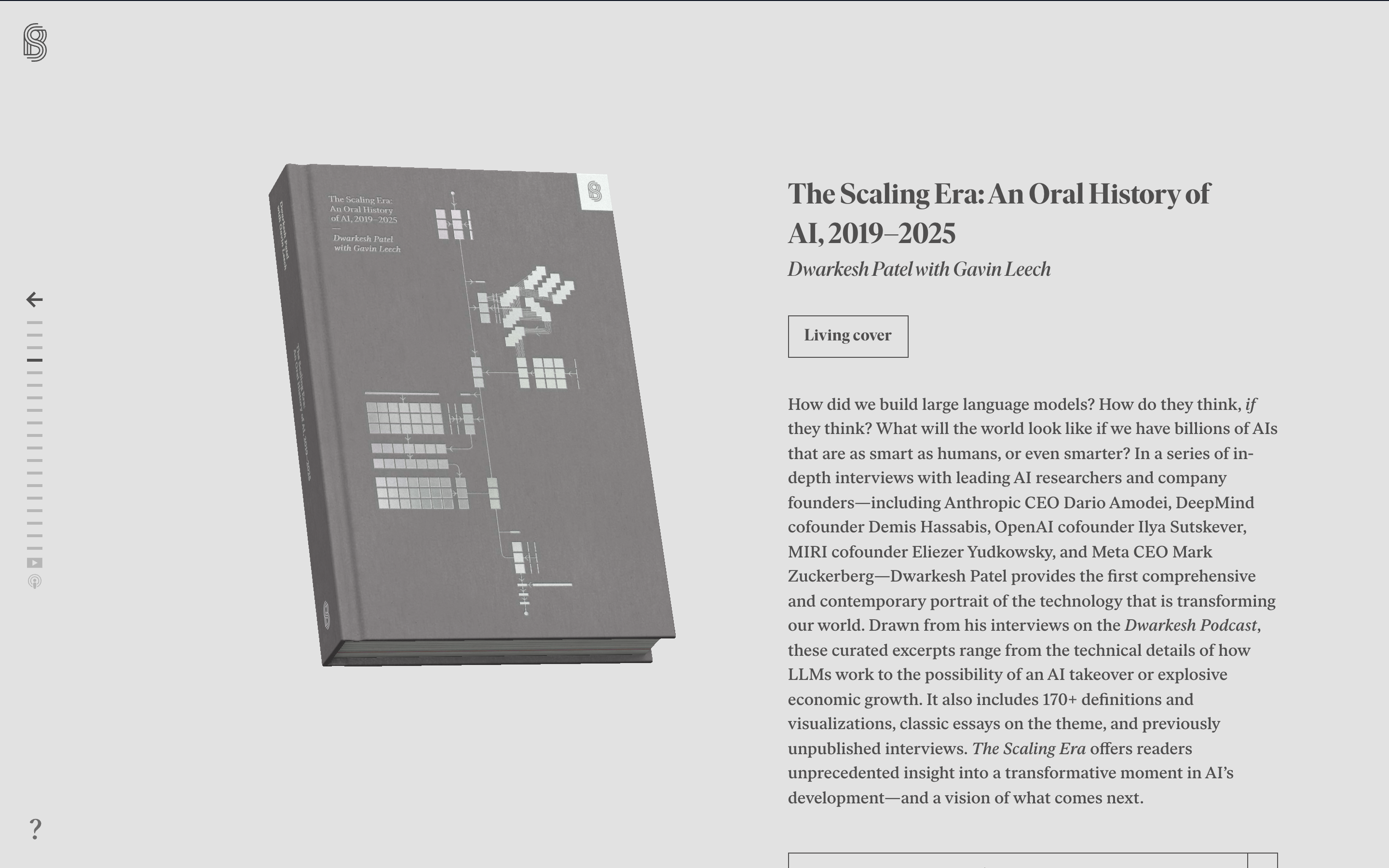 the light version
Picked 13-08-2026. His words: “I like this way of presenting things.”
One caution carried from the notes: the Stripe Press home page is dark, so it is banked for its mechanisms, not its ground. Each book’s own page is flooded in that book’s two colours and seven of the nineteen pairs are light; the footer is white. The light half of its palette is the half to reuse, and it is also the half that passes contrast. Detail in the model note.