31-07-2026 · captured from Viktor Oddy
The Marcus prompt
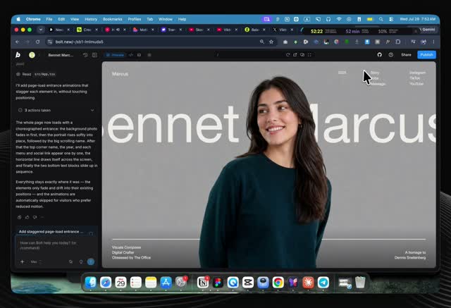
An editorial portfolio hero where a cutout portrait of a person sits ABOVE the page's own giant scrolling name, the letters reading behind the person. Frank's note: “this can help to have a person on top of a website, which is what I want.” This is the layering grammar the Valentina bust proposal uses, with video instead of a still.
- The z-stack. Background image, then giant scrolling text, then the person's cutout on top (never clickable, so it never blocks the page underneath), then the navigation. The person overlaps the letters, so they feel IN the page, not ON a card.
- The cutout. A see-through image of the person, full-bleed. With video, the same slot takes a see-through video bust instead.
- Choreographed entrance. Background fades in, then the person rises with a slight scale, then the surrounding chrome staggers in, then a rule line grows from the left. Everything collapses to a near-standstill for a reader whose system asks for less motion.
- One composition, no scroll. The hero fills the whole screen with nothing below it to scroll to; nothing competes with the person.
Full doctrine these techniques feed: 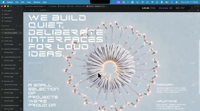 people in the page and the technique shelf.
Sister reference:  the NovaAI prompt (scroll-scrubbed video and the glass system). Tutorial where both come from:
  reference-viktoroddy-tutorial.html.
The prompt, verbatim
The prompt below is what Viktor Oddy actually pasted to Claude. Kept exactly as captured, including its own dashes and punctuation: a quoted artifact, not our prose.
Recreate this page **pixel-faithfully**. Single full-viewport hero. React + Tailwind CSS. No cards, no purple, no Inter/Roboto. Black/cream editorial portfolio look.

---

## Stack & page chrome

- Vite + React + TypeScript + Tailwind CSS
- Document title: `Marcus — Bennet` (em dash)
- Body font stack: `'Helvetica Neue ME', Helvetica, Arial, sans-serif`
- Load this exact webfont (print→all pattern):

https://db.onlinewebfonts.com/c/95cecf452d3208890088a5b4c19c7ecf?family=Helvetica+Neue+ME

- Tailwind theme extensions:
  - Color `cream`: `#efeee9`
  - Font family `hn` (and `sans`/`serif`): `"Helvetica Neue ME", Helvetica, Arial, sans-serif`
- Lucide React for the mobile close icon only (`X`, size `26`, strokeWidth `1.5`)
- Root section: `relative h-[100dvh] w-full overflow-hidden` — one composition, no scroll on the hero

---

## Exact asset URLs (do not substitute)

**Background image (full-bleed, behind everything):**

https://images.higgs.ai/?default=1&output=webp&url=https%3A%2F%2Fd8j0ntlcm91z4.cloudfront.net%2Fuser_38xzZboKViGWJOttwIXH07lWA1P%2Fhf_20260729_022513_486985a2-ac8c-4278-91a8-071dcd9fcaff.png&w=1280&q=85

**Front portrait (cutout overlay, above marquee, pointer-events none):**

https://stone-expand-60400629.figma.site/_assets/v11/8da570354e86aa0d44ac3e4aa335a72c8e750d68.png

Both images: `absolute inset-0 h-full w-full object-cover`.

---

## Layer order (z-index)

| Layer | z | Content |
|--------|---|---------|
| BG image | default | full-bleed background |
| Marquee name | `z-10` | scrolling "Marcus — Bennet" |
| Horizontal cream rule | `z-10` | above footer |
| Desktop footer | `sm:z-10` | bottom copy |
| Front portrait | `z-20` | cutout over marquee |
| Header + mobile footer | `z-30` | chrome |
| Mobile drawer | `z-40` | overlay + panel |
| Hamburger / close | `z-50` | always on top |

---

## Copy & links (exact strings)

- Brand / logo link (top-left): `Marcus`
- Year (desktop only): `2025`
- Nav column (desktop + mobile "Site Index"): `Story`, `Jobs`, `Message`
- Social column (desktop + mobile "Find Me"): `Instagram`, `TikTok`, `YouTube`
- Marquee (duplicated twice for seamless loop): `Marcus — Bennet` + non-breaking space, with `pr-[6vw]` on each span. Use HTML entity `—` between names.
- Footer left (three lines):
  - `Visuals Composer`
  - `Digital Crafter`
  - `Obsessed by The Office`
- Footer right (right-aligned):
  - `A homage to`
  - `Marcus Holloway`
- Mobile drawer labels: `Site Index`, `Find Me` (uppercase, `tracking-[0.2em]`, `text-cream/50`)
- All links: `href="#"` for now
- Front image `alt`: `Portrait`; BG image `alt`: empty

All UI text color: `text-cream` (`#efeee9`).

---

## Layout — desktop (`sm:` and up)

**Header** (`absolute inset-x-0 top-0 z-30 flex items-start justify-between px-6 pt-6 sm:px-10 sm:pt-8`):
- Left: brand `Marcus` — `font-hn text-lg tracking-wide`
- Right cluster (`hidden sm:flex items-start gap-16 lg:gap-24`):
  - Year `text-sm`
  - Nav: vertical stack `flex-col gap-0.5 text-sm`, hover `opacity-60` over `300ms`
  - Social: same stack/hover

**Marquee** (`absolute inset-x-0 top-[16vh] sm:top-[14vh] z-10 overflow-hidden`):
- Inner track: `marquee flex w-max whitespace-nowrap font-hn text-[16vh] sm:text-[26vh] leading-none text-cream`
- Continuous horizontal scroll: `translateX(0)` → `translateX(-50%)`, **30s linear infinite** (track is two identical halves)

**Cream rule** (`absolute inset-x-6 sm:inset-x-10 bottom-[5.5rem] sm:bottom-28 z-10 h-0.5 bg-cream`):
- Grows from left via `scaleX(0)` → `scaleX(1)`, `transform-origin: left`

**Footer** (`absolute inset-x-0 bottom-0 flex items-end justify-between px-6 pb-5 sm:px-10 sm:pb-8 text-xs sm:text-sm leading-relaxed font-hn`)

**Mobile-only** (`sm:hidden`): hamburger (3 cream bars in `h-10 w-10`, bars in `h-4 w-6`). Desktop nav/social hidden on mobile.

---

## Mobile drawer (`sm:hidden`)

- Backdrop: `fixed inset-0 z-40`, `bg-black/40 backdrop-blur-sm`, opacity 0↔100 over `500ms`; click closes; when closed: `pointer-events-none`
- Panel: right slide-in, `w-[80%] max-w-sm`, `bg-[#141414]`, `px-8 py-10`, `translate-x-full` ↔ `translate-x-0`, `600ms` ease `cubic-bezier(0.76, 0, 0.24, 1)`
- Lock `document.body.style.overflow = 'hidden'` while open
- Close button: Lucide `X`, absolute `right-6 top-6`; open: rotate 0 / opacity 1 (delay 300ms); closed: rotate 90 / opacity 0
- "Site Index" label: fades/slides up (delay 250ms); nav links `text-4xl`, staggered `300 + i*80` ms, from `translate-y-6 opacity-0`
- "Find Me" label: delay 500ms; socials `text-sm` wrap, staggered `550 + i*60` ms, from `translate-y-4 opacity-0`
- Hamburger morphs to X: top/bottom bars rotate ±45° to center (`500ms`, ease `cubic-bezier(0.76, 0, 0.24, 1)`); middle fades out `300ms`

---

## Entrance animations (exact)

Use `animation-fill-mode: both`. Honor `prefers-reduced-motion: reduce` by collapsing these to ~0.01ms / 0 delay.

| Class | Keyframes | Duration / easing | Used on |
|--------|-----------|-------------------|---------|
| `anim-fade-in` | opacity 0→1 | **1.2s** `ease-out` | BG image (no delay) |
| `anim-rise-in` | opacity 0→1, `translateY(4vh) scale(1.03)` → `0 / scale(1)` | **1.4s** `cubic-bezier(0.22, 1, 0.36, 1)` | Front portrait, **delay 300ms** |
| `anim-fade-up` | opacity 0→1, `translateY(28px)` → 0 | **0.9s** `cubic-bezier(0.22, 1, 0.36, 1)` | UI chrome (see delays) |
| `anim-line` | `scaleX(0)` → `1`, origin left | **1.1s** `cubic-bezier(0.76, 0, 0.24, 1)` | Cream rule, **delay 1200ms** |
| `.marquee` | `translateX(0)` → `-50%` | **30s** `linear` infinite | Name track |

**`anim-fade-up` delays:**
- Marquee wrapper: `500ms`
- Brand "Marcus": `800ms`
- Year + hamburger: `900ms`
- Nav links: `1000 + i*80` ms (Story/Jobs/Message)
- Social links: `1150 + i*80` ms
- Footer left: `1400ms`
- Footer right: `1550ms`

---

## Visual / interaction rules

- First viewport = one composition: brand, marquee name, one portrait stack (BG + cutout), one CTA-less chrome (nav/social), footer blurb — nothing else
- Portrait sits **on top of** the giant scrolling name so letters read through / behind the cutout
- Cream `#efeee9` on dark/photo; no cards, no pills, no glow, no purple
- Hover on desktop nav/social: `opacity-60`, `duration-300`
- No page scroll on the hero (`overflow-hidden` + `100dvh`)

---

## Implementation checklist

1. Wire Helvetica Neue ME from the OnlineWebFonts URL above; map Tailwind `font-hn` / `cream`
2. Full-viewport section with the two image URLs at the correct z-layers
3. Infinite dual-span marquee at `16vh` / `14vh` (sm), sizes `16vh` / `26vh`
4. Desktop header triple column + mobile hamburger → drawer with staggered reveals
5. Cream rule + dual footer blocks with exact copy
6. All four entrance animations + marquee with the delays and easings listed
7. `prefers-reduced-motion` short-circuit

Recreate this **exactly** as specified — same URLs, copy, spacing, z-order, timings, and font.