A form or app screen
Forms, dashboards and app screens, on a phone or a computer.
1
What we made
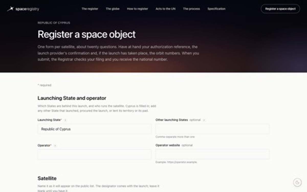
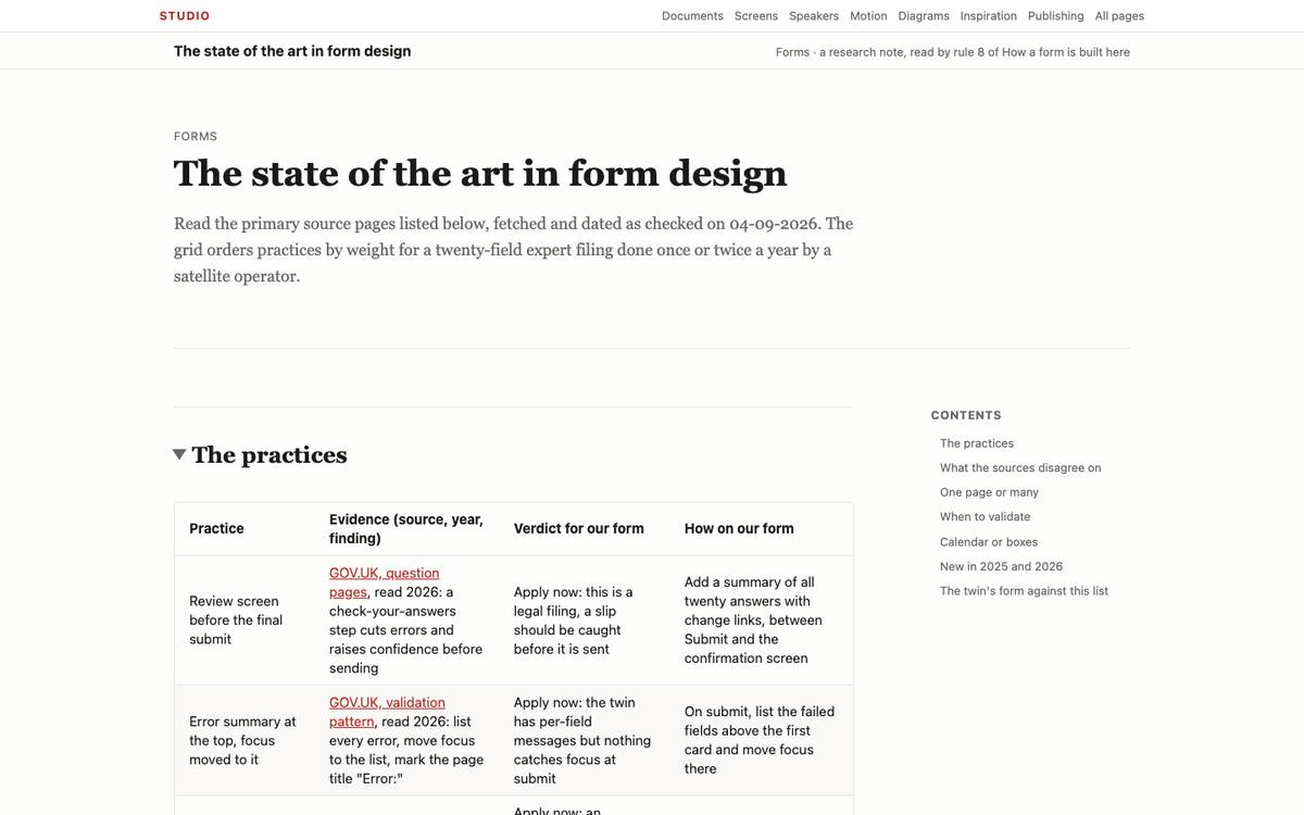
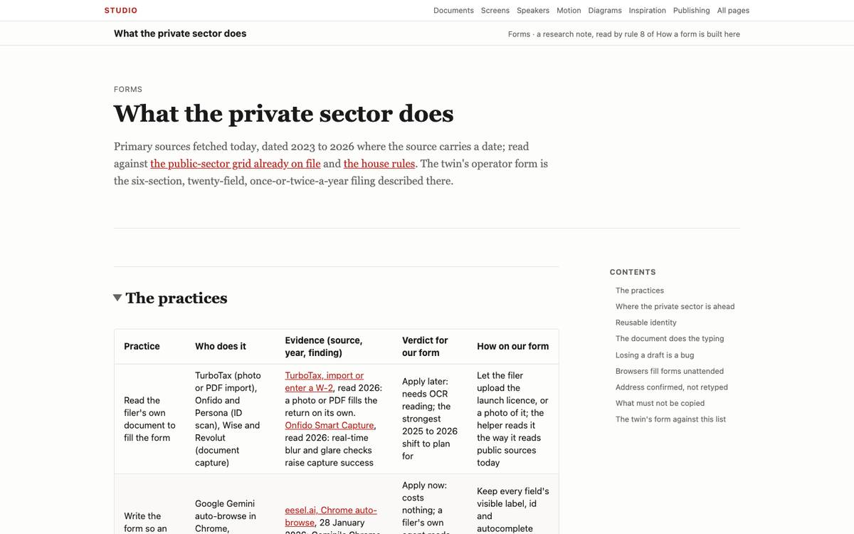
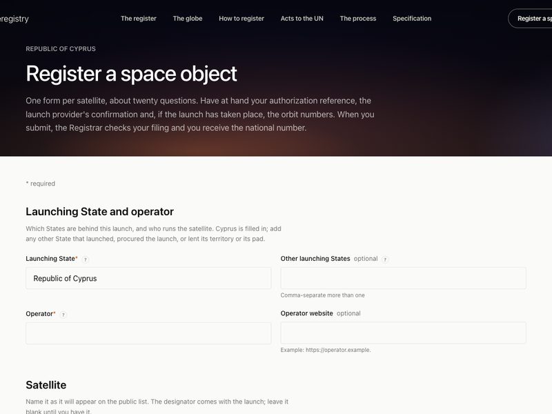
How a form is built hereSix rules read on a live operator form.
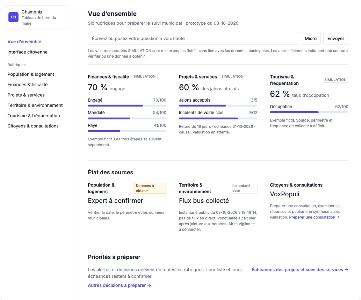
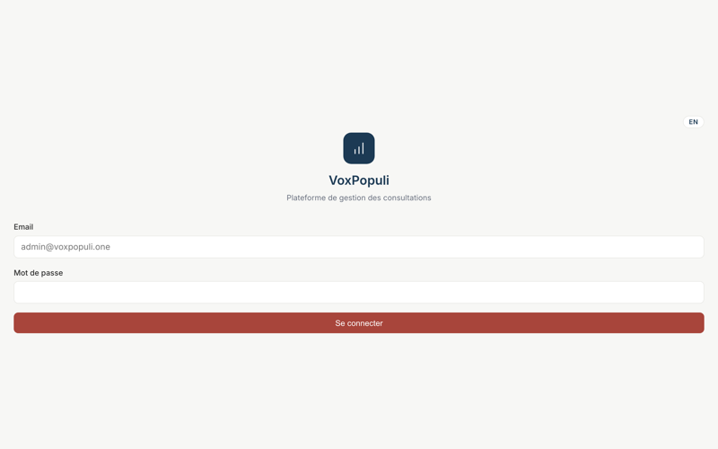
Tableau municipal, three optionsWorked example of 04-10-2026; option A, after Tremor, came closest.
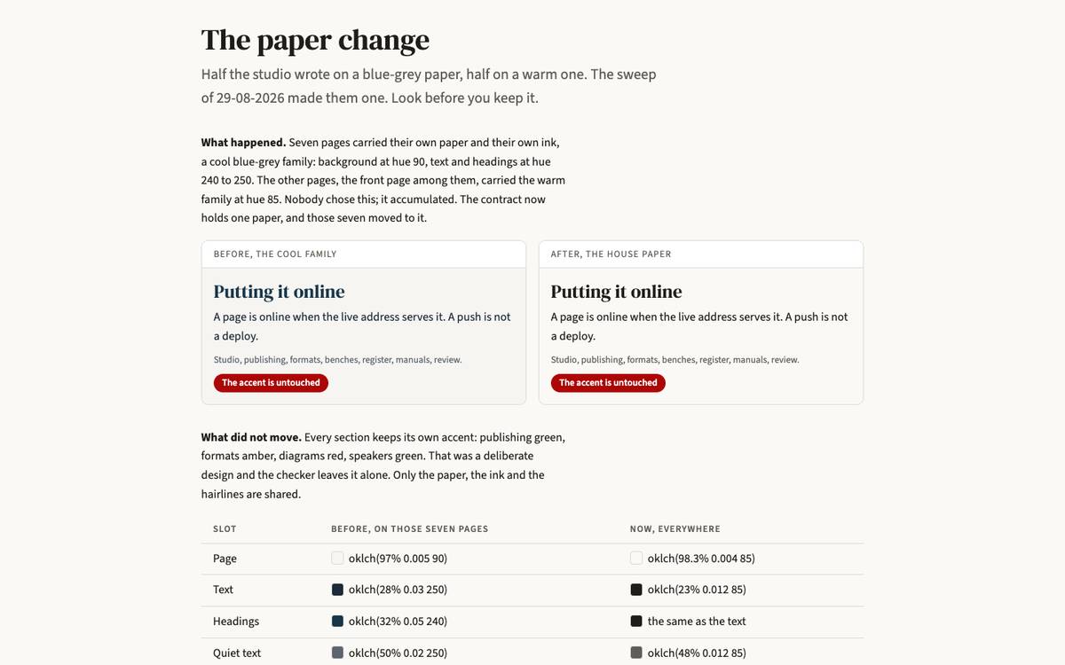
The paper changeA screen redesigned from the paper form.
2
References to pick from
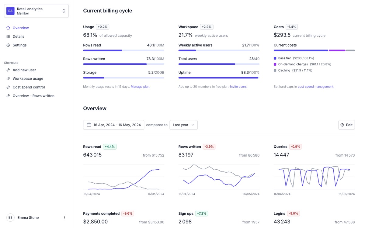
Tremor, dashboard templateCopy: Borderless metric sheet: label, small bordered badge, number with a plain-words unit, thin progress bars with the value on the right.
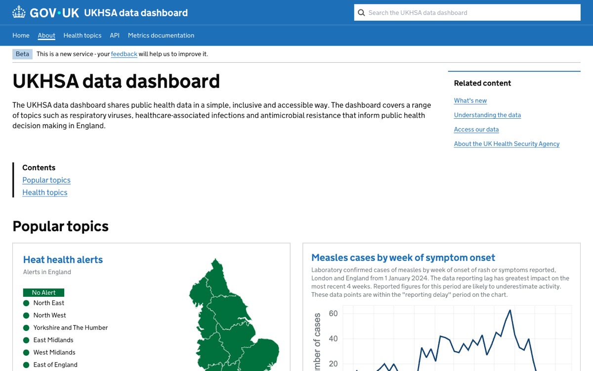
UKHSA data dashboardCopy: Public data in the GOV.UK way: a blue service band with search, bold plain headings, solid colour status tags, bordered topic cards.
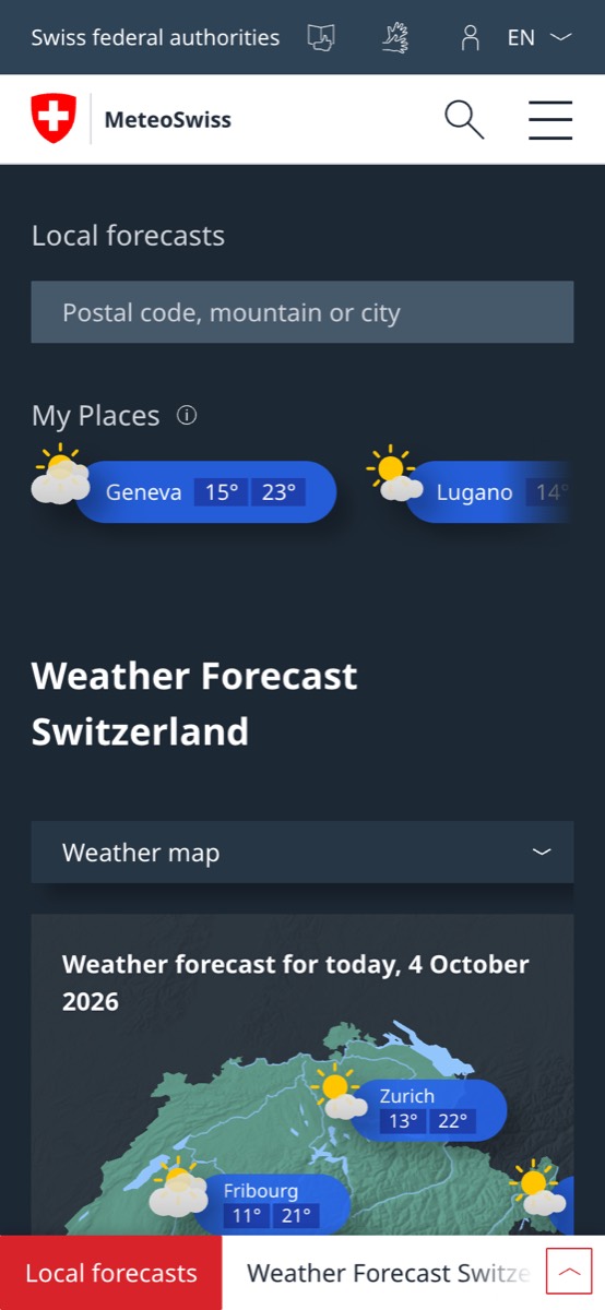
MeteoSwiss, homeCopy: Search first on a dark slate field, then saved places as blue pills with boxed value chips.
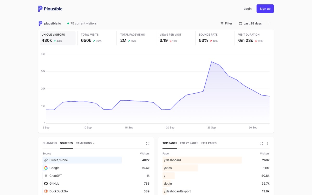
Plausible, live demo dashboardCopy: One row of five key numbers with small deltas over one large chart, then two plain ranked lists with bar fills behind the rows.
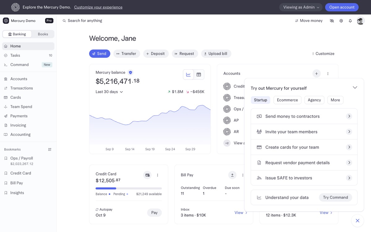
Mercury, demo bank dashboardCopy: A greeting, a row of action pills, then one large balance with its chart; quiet grey type, one blue accent.
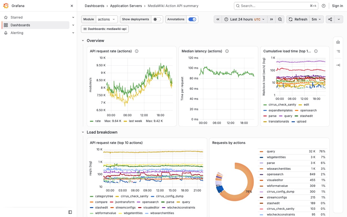
Wikimedia Grafana, API summaryCopy: A dense wall of time-series panels with collapsible rows and a time picker; the operations-room model.
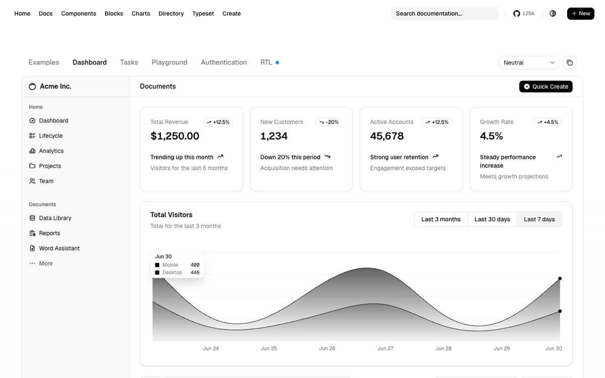
shadcn/ui, dashboard exampleCopy: Four stat cards with a trend badge and a one-line explanation under each number, over one area chart.
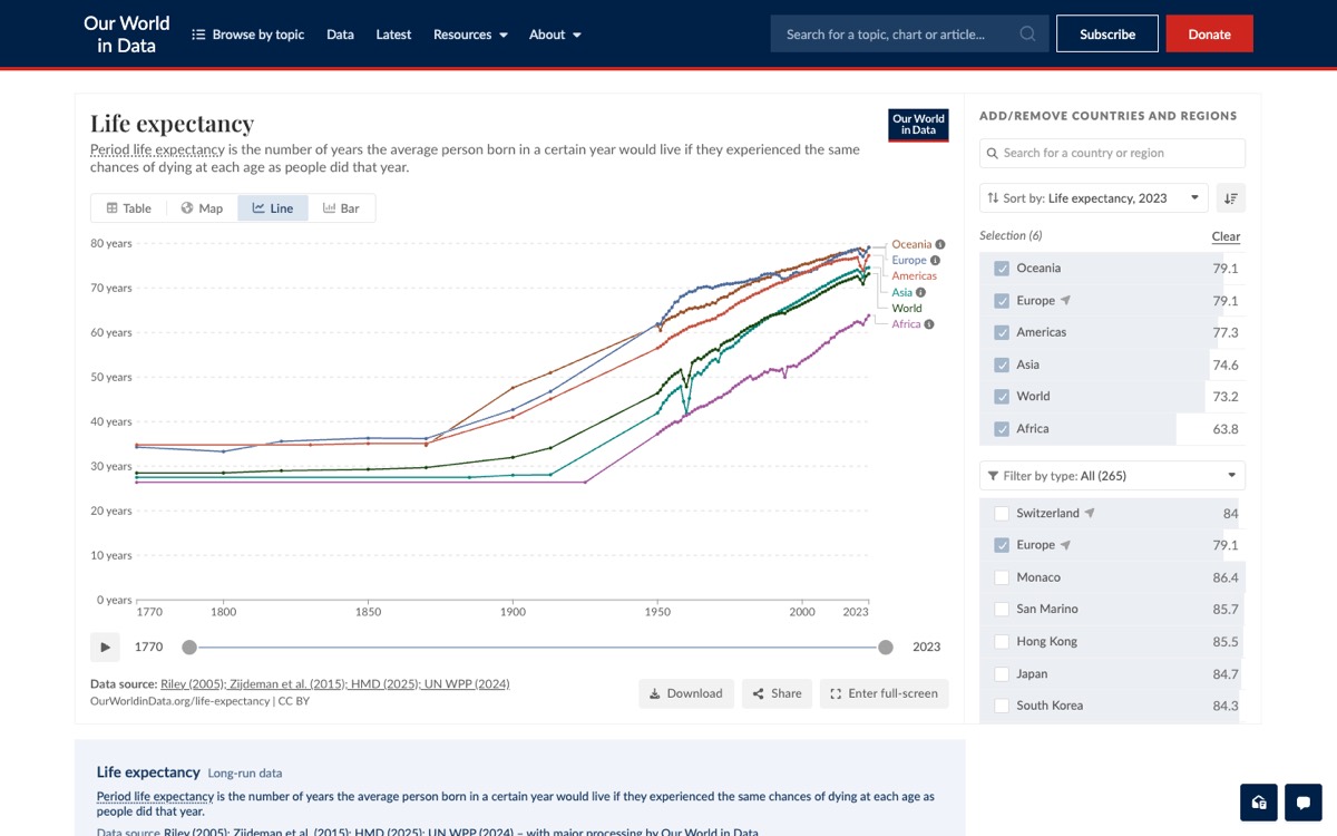
Our World in Data, grapherCopy: One chart per page with its source and download one click away; the honest single-indicator view.
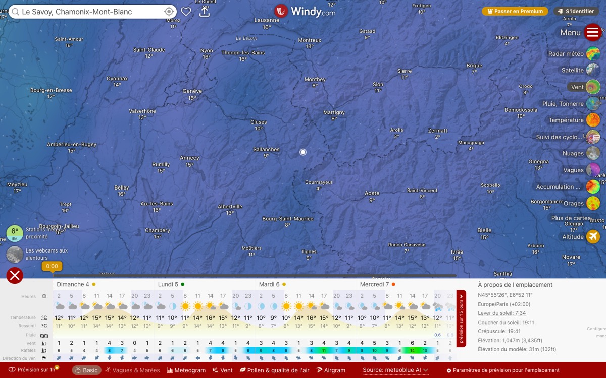
Windy, Chamonix forecastCopy: A full-bleed map as the screen, a forecast strip along the bottom, layers chosen on the right.
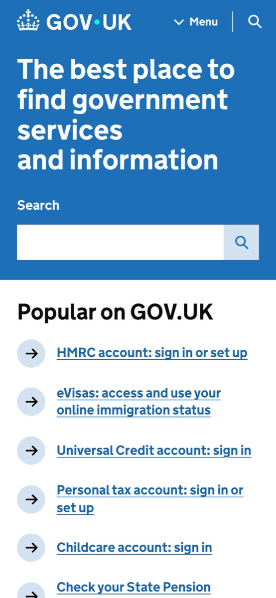
GOV.UK, homeCopy: A very large bold headline and one search on a blue field; the plainest public front door.
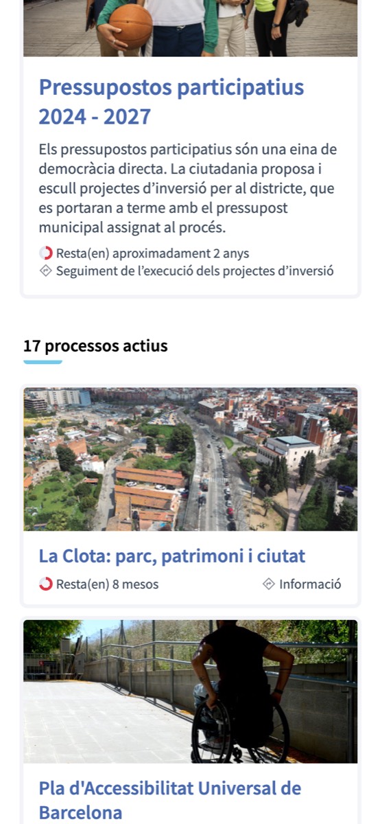
Decidim Barcelona, participatory processesCopy: Each citizen process is a photo card with its title, a plain description and its time left.
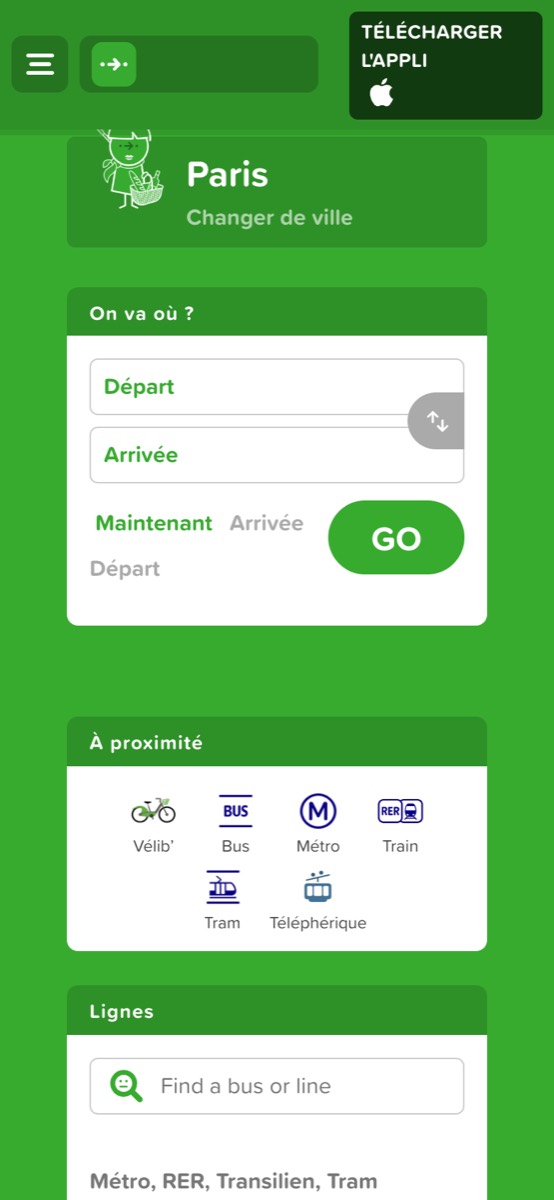
Citymapper, ParisCopy: One strong brand colour as the whole field, a white journey form as the single card, nearby modes as icons.
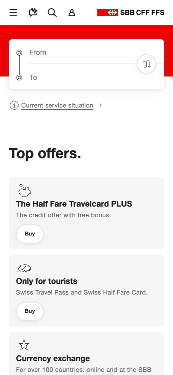
SBB, timetableCopy: A red band holding the from and to card, the service status one line below, offers as grey tiles.
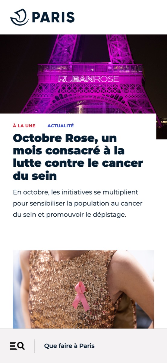
Paris.fr, homeCopy: A city site led by one large photograph and a heavy headline; news first.
3
How to make one
Give your Claude the recipe
Skills: modern-ui, screens-first-design, ui-reviewer (agent), space-registry-ui.
Then say: "Go to the studio's app screen door, pick three references and restyle the main screen of my app in three different ways."
What the agent does here
- Reads the product first: who, device, job, what the screen holds.
- Hunts the best interfaces of any sector.
- Keeps three different ideas that can carry that content.
- Restyles the real main screen three ways, on one board.
- Records the pick in the shown log.
The recipe
4
Rules and tools
Rules for a form or app screen
- Choose by quality of the interface, never by sector. (taste 10)
- Three options are three different ideas. (taste 1)
- Asterisks for required fields, numbered cards, a searchable list, an aligned help icon. (forms.html)
- Working pages use the whole screen. (principle 12)
Rule pages, the comparison and galleries